


Do Not Siege Walled Cities - 242
Katt Williams as Thanos

NEW YEAR
Already coming with a challenge or two, but what’s life if not a series of problem-solving exercises? I’m still excited about 2024. Gonna be a productive one for me and I am confident it will be for you too. So let’s go.
JUNIPER HILLS
I’m currently in a recording studio in the mountains(?) of California. Pretty, in a surface of the moon sorta way. Hills in California just look like cookie dough.
I was surprised at the relative despair at the nearby train station. Felt like downtown LA in a 20x20 box with a broken vending machine.
I’m recording an album. For most of my life this was a thing I did at no small personal expense. I used to pay for them. Then when labels would pay for them, I’d still be losing because I’d have to take time from work. But now I’m getting paid to do the thing. Which is a fun turn of events, but it’s difficult to shake the feeling that we should be moving faster. I had too many years of doing things the other way for me to feel comfortable playing Fortnite for a week while we track guitars.
On the upside, I’m learning more about fire than I ever anticipated. The studio is heated with wood stoves and boy is that a full-time job. At this point I’m like someone who learned to speak a language through immersion but couldn’t explain grammar to you. Why does fire need oxygen but then, at the exact right moment when it’s burning well, benefit from having the oxygen taken away? I dunno, but it works. So I just keep doing that. Meanwhile, the wood smoke is murder on my throat. Gonna sound like Tom Waits on this one.
TODD
Todd McFarlane is doing the podcast rounds and I’m always happy to see it. His talking points don’t change much over the years, but there’s always some new articulation of those ideas.
In his recent Inkpulp appearances he touched on a thing that should be obvious but feels lost on many creators in 2024: the more work you have, the more work you can exploit should things break in your favor. Meaning, if you’ve done 50 issues of your own property, and that property is made into a movie, that is 10 trades, an omnibus, four tankobons, x number of hardcovers, a few coloring books, etc, that you can bring to market (or bring back to market) to capitalize on the exposure that comes with a successful television show.
Meanwhile, if you’ve done 50 issues of Marvel work, the only thing you can do with that is more Marvel work. Or pivot to another career like games. But you can’t dictate how your work will be maximized.
Maybe that seems like a luxury problem to have and you can’t construct your career around the hope you’ll have a mid-to-late career break into other media. But, I’d argue the journey is the destination in so many ways. If you don’t get that TV/movie/videogame pump, you still have 50 issues to repackage until you’re in the grave.
I disagree with him and, frankly, the way he carries himself more often than not, but I have an enduring respect for Pat Mills. Just a monster creative force I think American readers don’t fully recognize. To read his Twitter is to roll through a type of casual but endless grievance log. He’s successful so you don’t get the type of bitterness you might from someone in the struggle. But, man, his animus towards his former publisher 2000AD is enough to power a small city.
Mills can only give suggestions to a publisher he does not get along with regarding the repackaging of material credited to him. And more often than not, they do not listen. For someone with Mills’ resume and (rightly earned) ego, this must feel like a major insult. While most of us would love to have Mills’ career, in this regard he’s a victim more than a force and it would suck to be in his shoes.
You could avoid that. If you worked for yourself. And that’s no knock against Mills. He was as forward-thinking as anyone of his era managed to be. But whatever headwinds he had against him- you do not share. You can own what you do. So do that.
WHERE WAS IT
I just read WHERE THE BODY WAS, the new graphic novel from Ed Brubaker and Sean Phillips.
If you’ve been keeping up with these creators, you may have noticed their work taking an almost anecdotal turn. I don’t mean to say it has no weight, rather some stories just don’t feel the need to reach high drama before their conclusion. WHERE THE BODY WAS is in that mode, but introduces what I would almost call impressionistic elements that feel NO commitment to traditional story.
Calling it ‘dreamlike’ would be lazy, but it’s not quite as serious as reality tends to be. Calling it ‘unfinished’ would be unfair, but it just doesn’t really give a shit about acts or payoff.
If you like it, all this was a stylistic choice. If you don’t like it, the work lacks gravitas and needed more time to cook. I’m of the former view. It feels like what it is, a memory from childhood expanded on and put to paper. Can you fly too close to shaggy dog? Of course, and I’m sure I’ve done it in my own work. But I’m 50min into the Altman film California Split and I’m yet to detect a plot as such. And I’m loving every minute. Sometimes characters and vibe are enough.
YOUTUBES
HOW DOES EVERYONE KNOW BUT THE EDITORS?
Artist-and-Twitter-user turbostunkk tweeted “Idk if this is a hot take or not but like 90% of comics would look better with flat colors” and followed it with the following side-by-side.
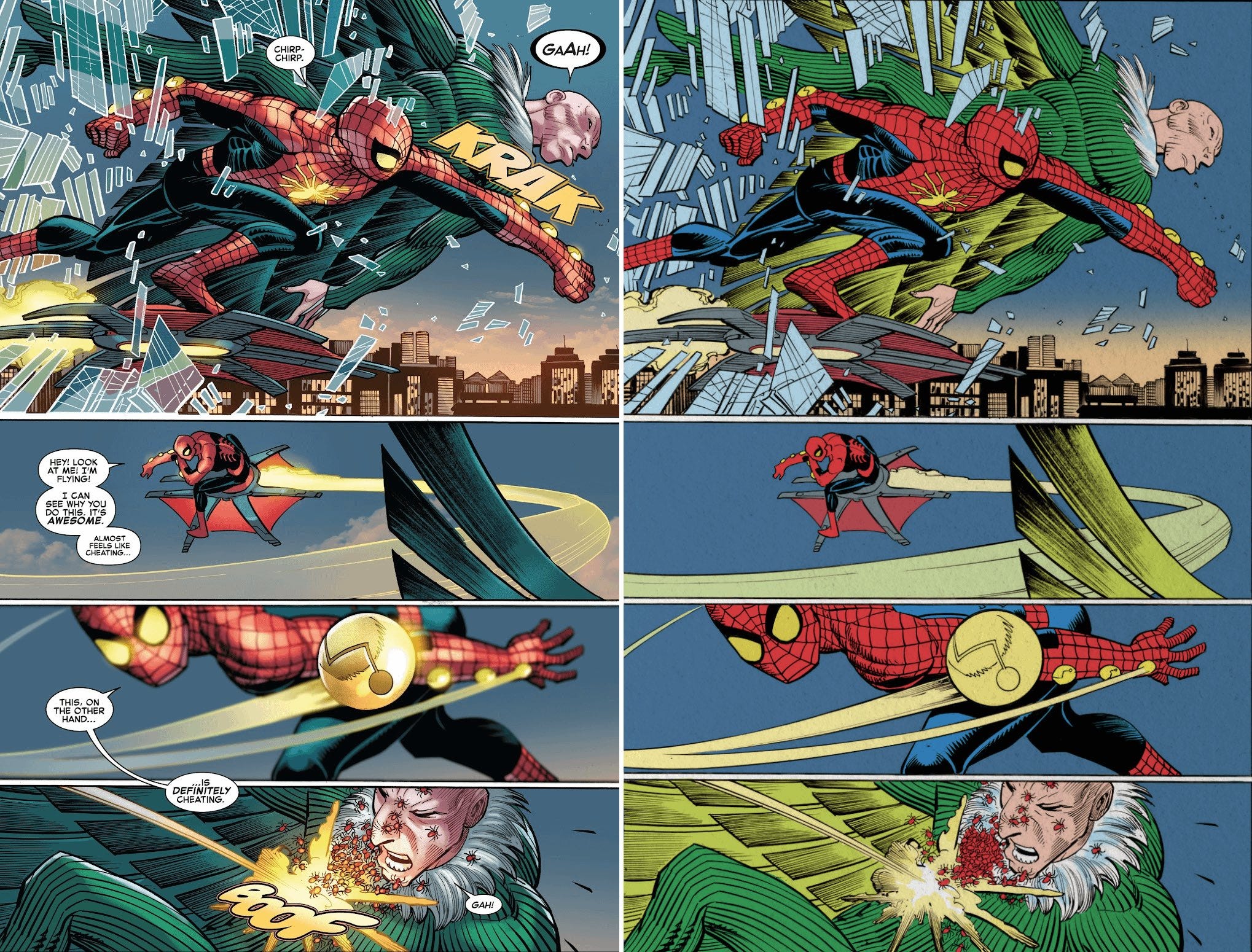
The page on the left is as it was published and the page on the right is turbostunkk’s edits.
Honest question: even allowing for personal tastes and changing sensibilities… is there a living person anywhere on Earth who thinks the left looks better? Is there anyone who could put into words what the benefits to readability or even just ‘cool factor’ might be? On its own merits, the page on the left is fine (though the gradient action lines are objectively terrible). But by comparison to the page the right, it’s horrendous.
Panel 1- the flat colors improve the clarity of the action
Panel 2- the flat colors make the panel look INFINITELY cooler
Panel 3- the flat colors aren’t doing… whatever the fuck the shaded colors are doing to Spider-Man’s costume here
Panel 4- the flat colors make this tight panel more immediately readable
Marcio Menyz, the colorist of the original took the critique in good spirit. I imagine he’s following mandates and perhaps feels some need to do the most to justify his position to editors.
Some tried to justify it with “flats look bad on the current paper stock” but I’d need some citation there. What proof do we have of that?
Others got in on the action, this one from a user named likeanoutlaww.
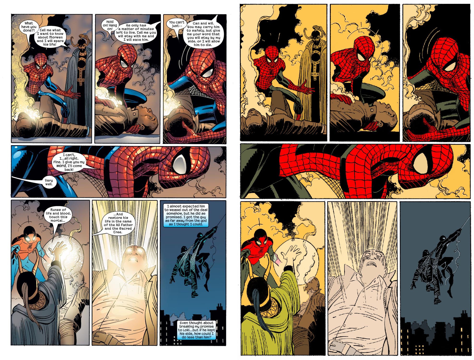
Now, to my knowledge, this guy isn’t a colorist of any sort. And I can see a vet taking issue with some of his choices. But, damn, if his take doesn’t let JRJR’s art BREATHE. Other than the final panel, these are all relatively tight shots. With a relatively (for 2020s) high panel count on the page. The shaded colors make that a visual mess. The flats make it look like high art.
Again, everyone knows this. It takes a glance. So why are editors fixated on making print comics look like the Artstation homepage?
WHAT AM I FORGETTING?
Outside of the BATMAN: LEGENDS OF THE DARK KNIGHT arc I’ve been putting off talking about because it’s so dull, am I leaving anything out this week? Was there any news? I don’t recall any. Maybe I was on a plane. Whatever the case, I’m done for the night. Have a good week. Get something done. Do for self.